統計モデルの評価基準
拝啓
未来の僕へ.いかがお過ごしでしょうか.暇な時間はありますでしょうか. いずれこのページを埋めてくれることを祈っております.
敬具
いつかやるのです
統計モデルの評価
クロスバリデーション
AIC
KLDを参照すると良いかも
BIC
判別分析の評価
ROC曲線とAUC
判別結果は閾値 $T$ によって
\[\hat{y_i}= \begin{cases} 1, \hat{p_i} \geq T \\ 0, \hat{p_i} \leq T \end{cases}\]と定められます.当然,$T$ の値次第で TPR や FPR の値は変わります.一般に,TPR が上がると FPR も上がる,トレードオフの関係が成り立っています.従って,良い判別モデルとは,閾値 T を変えていった時に, 最も TPRが大きく,FPRが小さい モデルであることになります.
この関係を図にしたのが ROC曲線およびAUC (area under the curve) です.
Python code
1
2
3
4
5
6
7
8
9
10
11
12
13
14
15
16
17
18
19
20
21
22
23
24
25
26
27
28
29
30
31
32
33
34
35
36
37
38
import numpy as np
import matplotlib.pyplot as plt
from sklearn.datasets import make_classification
from sklearn.linear_model import LogisticRegression
from sklearn.model_selection import train_test_split
from sklearn.metrics import roc_curve, auc
# ランダムな2値分類データセットの生成
X, y = make_classification(n_samples=1000, n_features=2, n_informative=2, n_redundant=0, n_clusters_per_class=1, random_state=42)
# データをトレーニングセットとテストセットに分割
X_train, X_test, y_train, y_test = train_test_split(X, y, test_size=0.3, random_state=42)
# ロジスティック回帰モデルの作成とトレーニング
model = LogisticRegression()
model.fit(X_train, y_train)
# モデルの回帰線と決定境界をプロットするための設定
x_min, x_max = X[:, 0].min() - 1, X[:, 0].max() + 1
y_min, y_max = X[:, 1].min() - 1, X[:, 1].max() + 1
xx, yy = np.meshgrid(np.linspace(x_min, x_max, 500), np.linspace(y_min, y_max, 500))
# モデルによる決定境界
Z = model.predict_proba(np.c_[xx.ravel(), yy.ravel()])[:, 1]
Z = Z.reshape(xx.shape)
# 図のプロット
plt.figure(figsize=(8, 6))
plt.contourf(xx, yy, Z, levels=[0, 0.5, 1], cmap='RdBu', alpha=0.6)
plt.colorbar(label='Probability')
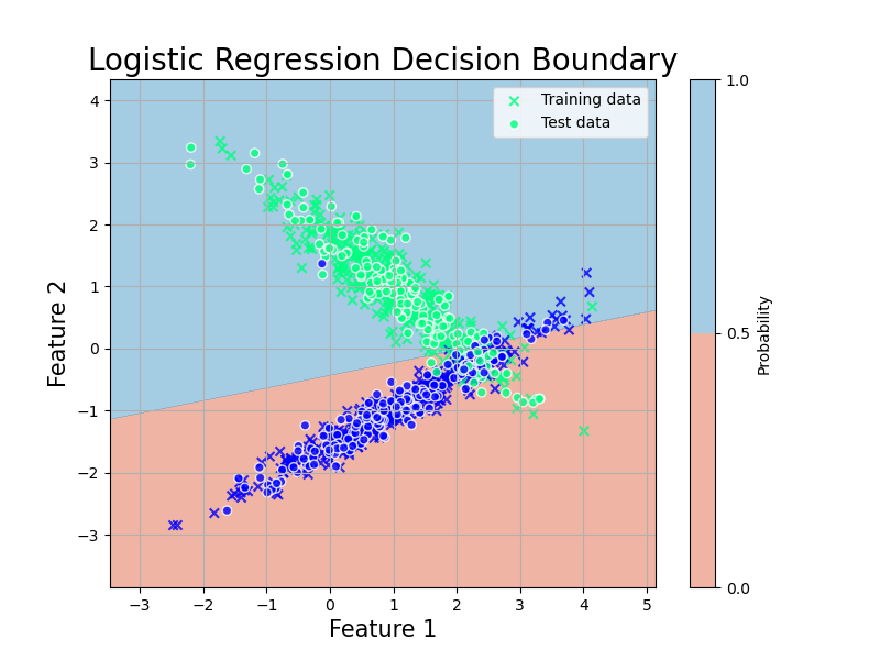
plt.scatter(X_train[:, 0], X_train[:, 1], c=y_train, cmap='winter', marker='x',edgecolors='k', alpha=0.8, label='Training data')
plt.scatter(X_test[:, 0], X_test[:, 1], c=y_test, cmap='winter', edgecolors='white', alpha=0.8, label='Test data')
plt.title('Logistic Regression Decision Boundary', fontsize=20)
plt.xlabel('Feature 1', fontsize=15)
plt.ylabel('Feature 2', fontsize=15)
plt.legend()
plt.grid(True)
plt.savefig('../figures/logistic2.png')
1
2
3
4
5
6
7
8
9
10
11
12
13
14
15
16
17
18
19
20
# テストデータに対する予測確率
y_scores = model.predict_proba(X_test)[:, 1]

# ROC曲線とAUCの計算
fpr, tpr, thresholds = roc_curve(y_test, y_scores)
roc_auc = auc(fpr, tpr)


plt.plot(fpr, tpr, color='darkorange', lw=2, label='ROC curve (area = %0.2f)' % roc_auc)
plt.plot([0, 1], [0, 1], color='navy', lw=2, linestyle='--')
plt.xlim([0.0, 1.0])
plt.ylim([0.0, 1.05])
plt.xlabel('False Positive Rate', fontsize=15)
plt.ylabel('True Positive Rate', fontsize=15)
plt.title('Receiver Operating Characteristic', fontsize=20)
plt.legend(loc="lower right", fontsize=15)
plt.grid(True)

plt.tight_layout()
plt.savefig('../figures/ROC.png')
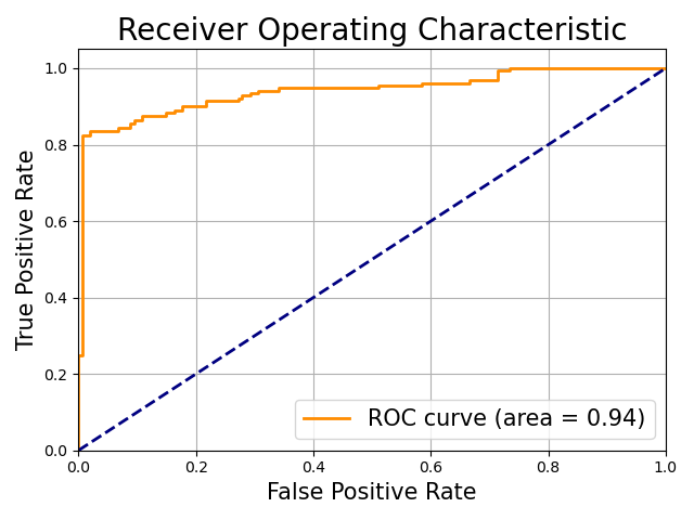
AUC は ROC 曲線の下の面積です.この図だと 0.94 ですね.TPR が大きく FPR が小さい時に面積は大きくなるので,これはかなり良い例です.論文でもよく使われている指標です.
実用上,青線の $\text{TPR} = \text{FPR}$ となる破線に並行な直線をスライドさせ,ROC 曲線との接線を求めることで最適な閾値 T を選択することが可能です.